
JACKED UP
This is a project where we were challenged to make a cylindrical package design of a baking powder mix of our choice. This project helped me learn more about the importance of keeping margins and having a good layout, which was good because I was struggling with this concept before.


Sketches and Doodles
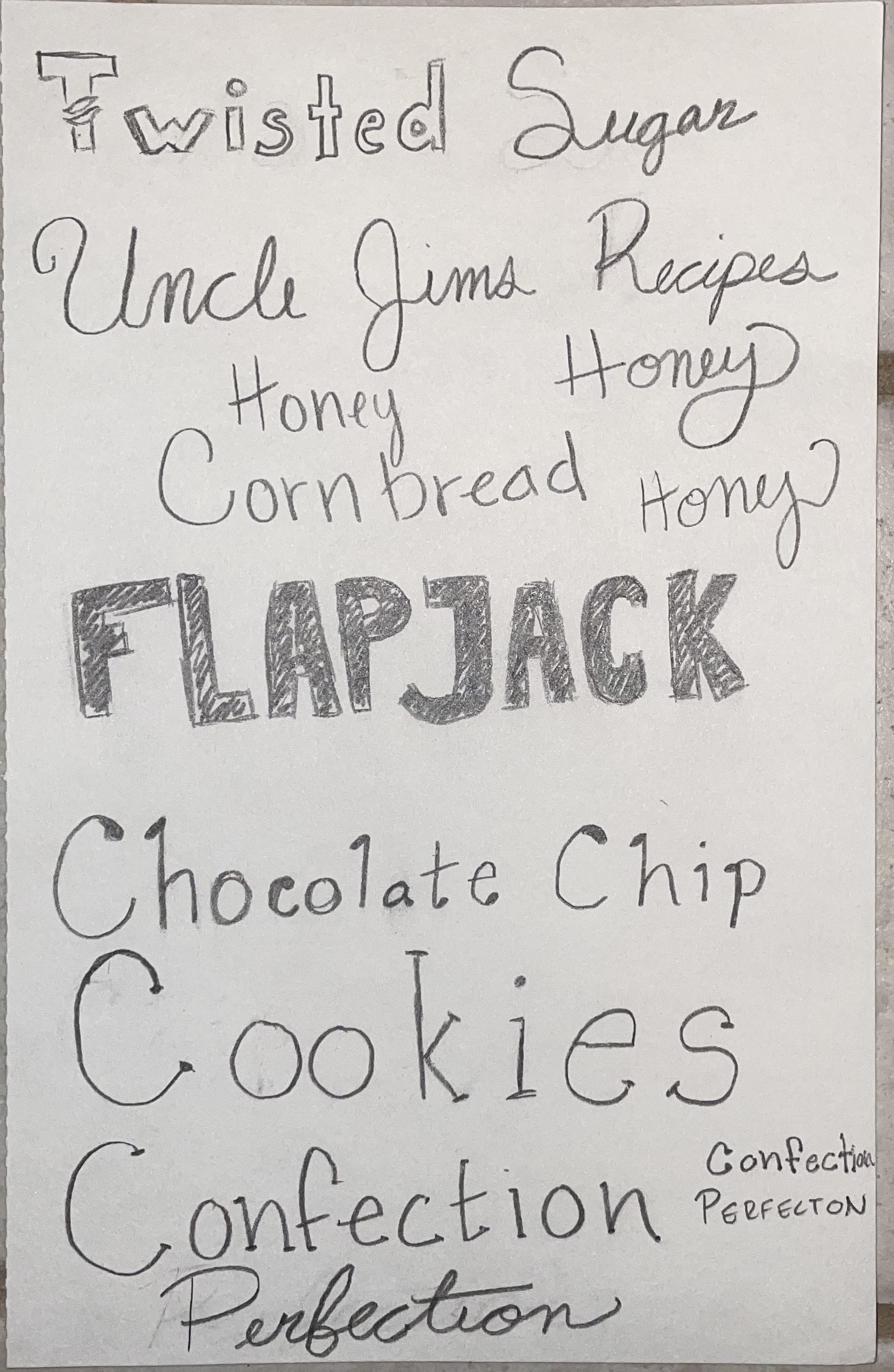
As with all my projects, I start with the brainstorming and sketches and doodles to get the ideas flowing. These are the sketches and doodles I came up with for this assignment. I wanted to play with the brand name (required to have), the product name, and what product I would be selling. I went to some different stores to get some inspiration as well as how to present them in a way the customer could enjoy.
Final Hand
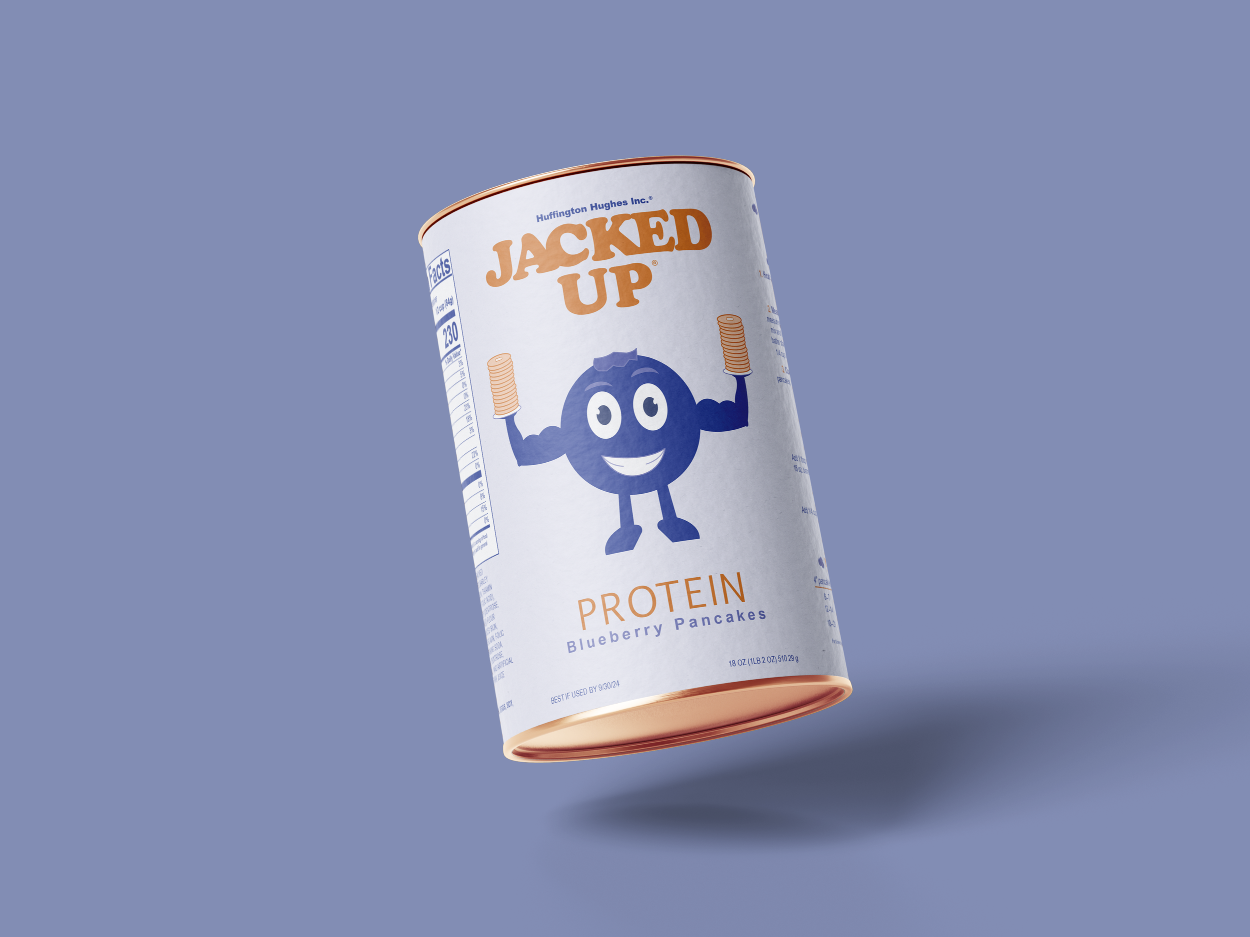
There are a couple of steps in between, but the idea I ended up going with is a product called “Jacked Up” containing protein blueberry pancakes. I created a cartoon blueberry because I thought a cartoon might stand out against all the photography based packaging I saw in a lot of stores. Before the final hand, I struggled a lot with the layout. It was a lot trickier to get all the information I needed on there than I previously thought. It was an interesting challenge that I learned a lot from.


B&W Computer Progressions
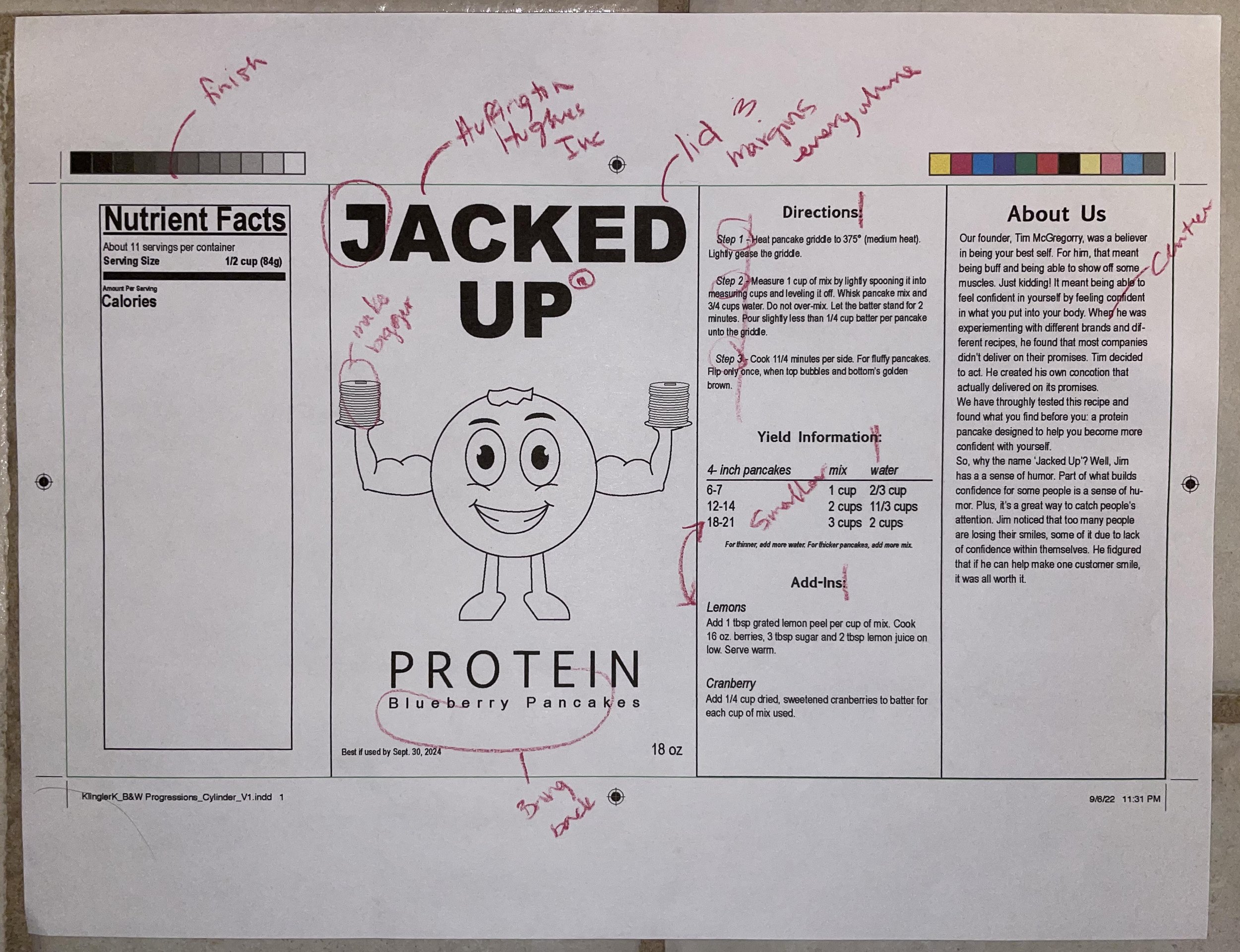
As I mentioned above, this one took me a while to figure out the layout. I thought I figured out the majority of it with the hand final, but when it came to the actual text I needed to have on the package, it became even more tricky. I learned a lot about keeping things concise and how to lay things out for the consumer buying this product.


Color Combinations and Studies
Since this was a two color project, I chose five colors to have some options when it came down to the application of the color combinations. I wanted to try overprint on this project, so I made sure to include a page of overprint options I could refer back to while making color combinations. I’m grateful to myself that I did because it ended up being really helpful. I also came up with three different combinations I thought would look best together. There was really only one of these that worked for me, so it was an easy decision. It still needed some changes before I turned it in, but I felt more confident in my progress.


What Was Turned In
This was the end result! Well, at the very least, it was the version that I turned in to the professor. I was really proud of my blueberry character and the challenges I was able to overcome with the layout. Some suggestions were made by my fellow classmates and professor. Some of those were to make the blueberry darker like a real blueberry would be, working on some kerning here and there, and working on the directions section, mainly making it more fun and engaging for the customer.


Final Revisions
I love the final result! I wasn’t sure about them at first, but as I continued with my classmates suggestions, the more I fell in love. I fixed the directions section, added more blueberries around the cylinder, and made my blueberry character darker. They were all subtle changes, yet they made s huge impact on the overall design. Overall, I’m proud of how it came out and for the challenges I overcame.
