
BOTANICAL BEAUTIES
Botanical Beauties is a project where we had to design a bag for flower bulbs. For this project, I used the elements of illustration and photography combined to create a fun design customers would enjoy and want to buy. One of the most challenging parts for me was designing the diagrams on the side, but I learned a lot!


Sketches and Doodles
These are some sketches and doodles I made to start coming up with ideas for this project. This always helps me get out some fun ideas, even if I don’t end up using most of them. I tried messing around with different flowers and leaves and even some different art styles. I also messed around with different fonts as well as different names for the flower bulb company. I enjoy making puns, so you can imagine the mayhem of company names I came up with.

Hand Final
After some tweaking and deciding between ideas from some earlier steps, this is the idea that won! I decided to go for the Botanical Beauties brand name and to advertise the pacific ocean dahlia bulbs (mainly because their my favorite flower). It’s more finalized than my other ideas, but still needs some work before it looks like a product to put on the shelf.

First Version

Third Version
Second Version

Fourth Version
Black and White Progressions
The next step is to go to the computer! Honestly, it’s always super exciting and tempting to jump straight to the colors, but it’s more important to get the design nailed down first. Especially for this design, I’m grateful I finalized the design first. As you can see, there are some drastic changes that happen between the first and fourth versions. I had a lot of help from my professor and classmates and took a lot of their different ideas and inputs to produce what I thought looked best. I’m really liking the layout and how it’s starting to come together nicely.


Color Studies and Combinations
I had a lot of fun messing around with these colors! This was a three color job, so I tried to see which colors would go better together. I also tried some overprint on some of them, just trying to do something new and give the illusion that I had a fourth color. I tried to choose bright colors since this is a bag that is trying to entice customers to buy these flower bulbs. None of these were working for me the way I wanted until I found a color combination I hadn’t tried yet. It’s on the next section, but I ended up liking that version much better. I’m glad I did so many different options because it helped me to get to the final result, which is so much better, in my opinion.
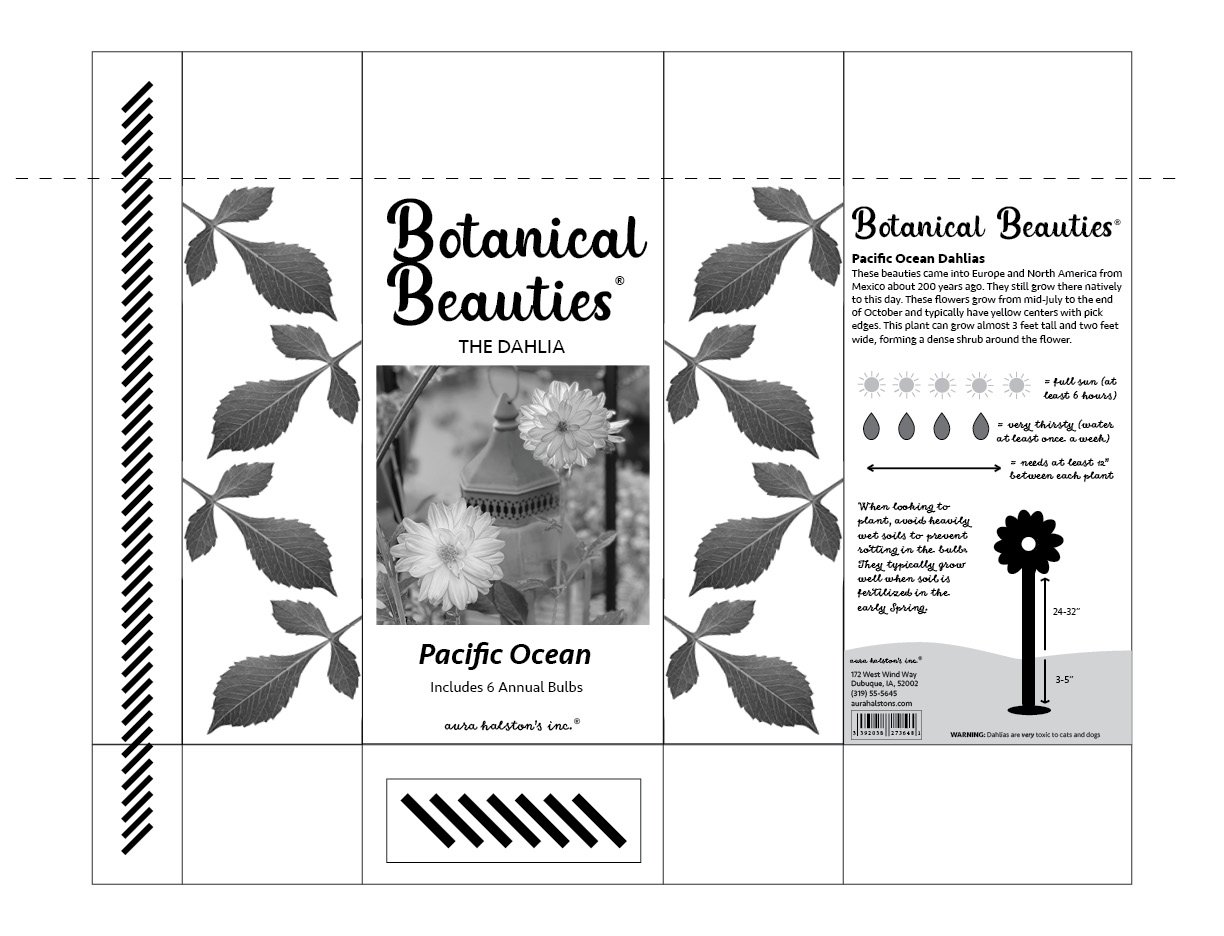
Turned In Final
This is the version that I turned in to my professor. I am super proud of how far I came up to this point from what it originally looked like to what it looks like now. It’s a giant step up! During the project critique, I got some great advice and some fun ideas on how to make it better than it was. I agreed with a lot of their comments, one of them mentioning it’s not bright enough to stand to stand out from the other bulb packages, I was also grateful to learn about duotones and how to make them, which I think really saved the leaves on the side.
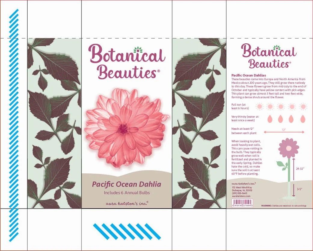
Result After Revisions
This version looks so much better than the one above! I am so happy that I learned from my fellow classmates and made certain changes to make the design better, cleaner, and overall more appealing. Even though the project is over, I wanted to keep it at the three colors. I know it would be easy to make this a four color job, but I like the challenge of keeping it to three. This is certainly one of the projects I am most proud of.

