Personal Branding
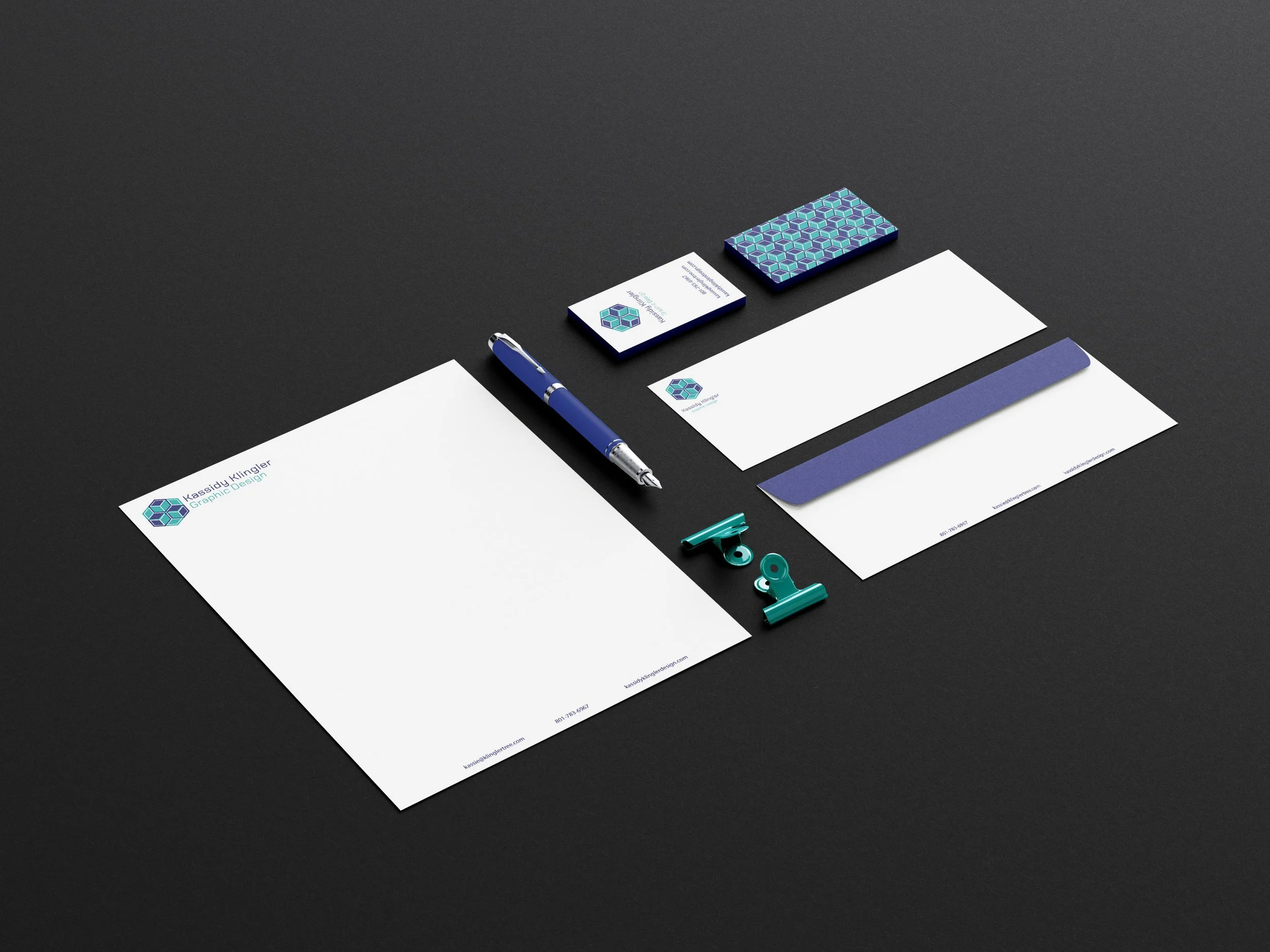
This was a challenge for me because I didn’t know what logo would or could represent me and my talents as an artist. It was honestly a little overwhelming. I even got way ahead of myself in the beginning because I was so excited and nervous. But, after I found my idea, I took off like a rocket and had so much fun designing and getting my logo just right. Now, I am super happy with how it turned out and proud of myself for overcoming a challenge.
Sketches and Doodles
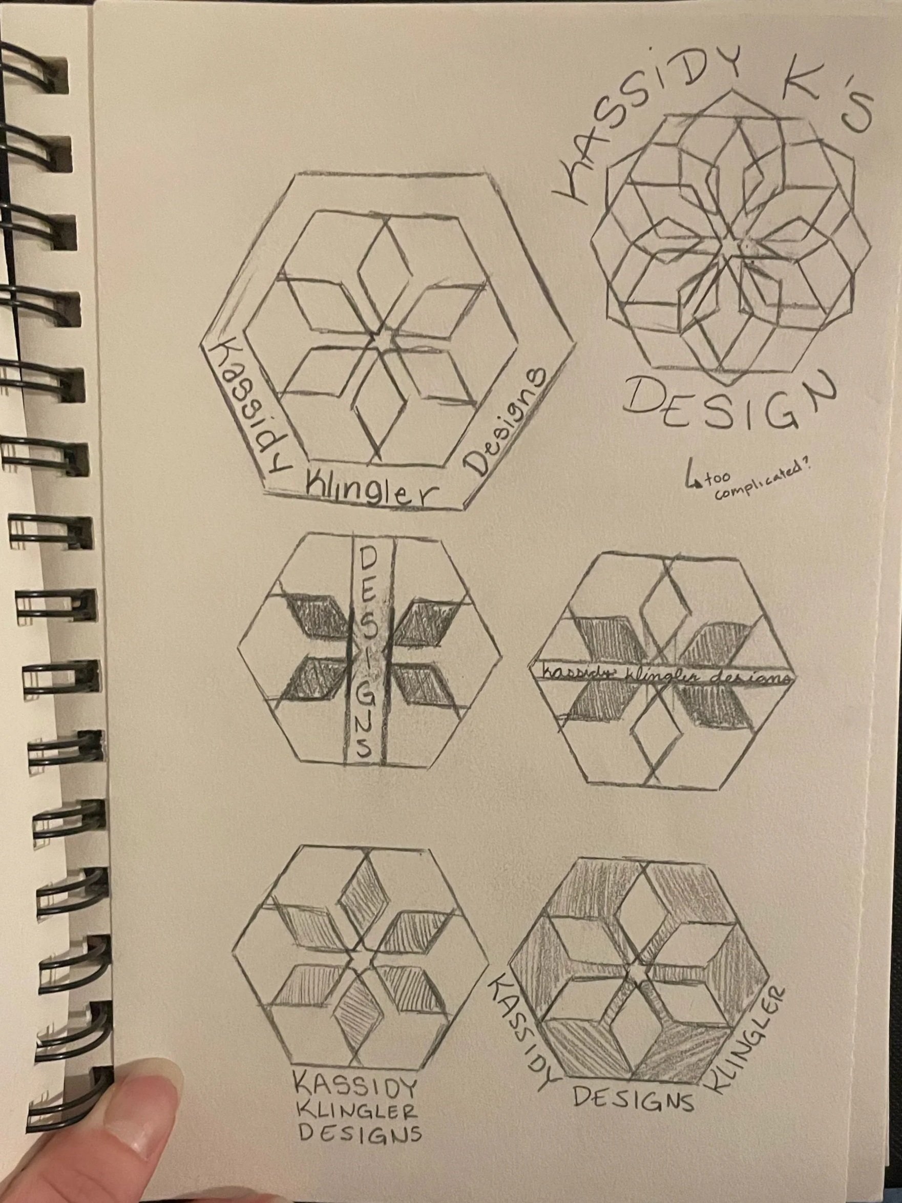
After I did some research on the different logos I liked, I went to my sketches and doodles! Some of them are a little rough, but that’s why it’s a sketch. A lot of them messed around with the idea of putting my initials in the logo somewhere, but nothing I tried worked. It was fun to mess around and try to find something I liked. In retrospect, I could’ve messed around with other shapes and tried more creative things, but I wanted to be unique and use something I had designed a couple years prior, which is what you see here. To me, nothing was more ‘me’ than something I made while I was goofing around, trying to see what I could do when I was first starting to create digitally. Now, I could improve on it.
Black and White Computer Progressions
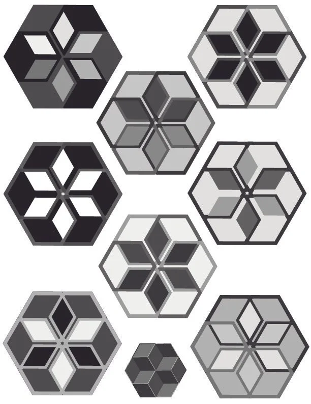
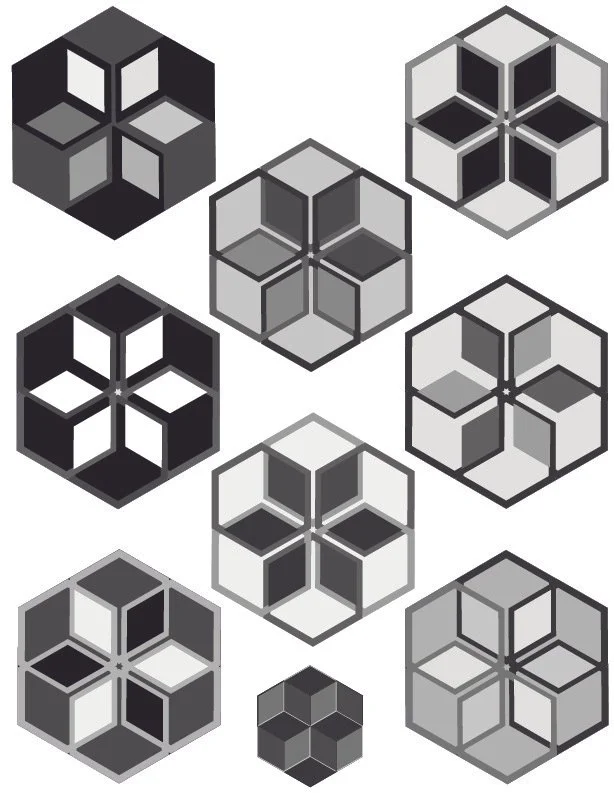
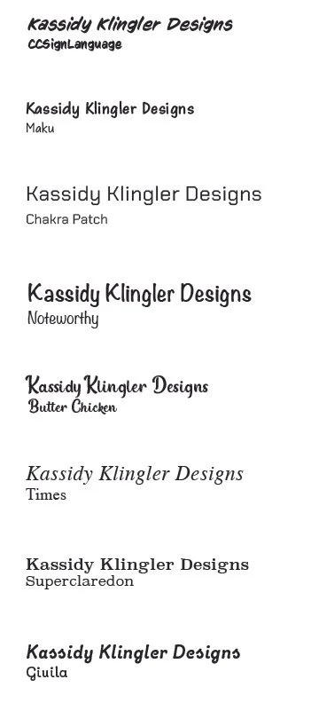
As I mentioned above, I was so excited to jump right in and start designing! I tried a couple straight on, then a couple on their side to see how it would look and which ones I like better. It was kind of hard for me to be more creative at this stage without color, but I knew that color only made things more complicated and it’s more important to get the design down than to get overwhelmed with the color. I also messed around with a couple of different text styles to see which one would match best with my hexagon design. In the end, I went with Chakra Patch. It’s kind of robotic with straighter edges, which I felt matched the hexagon style perfectly.
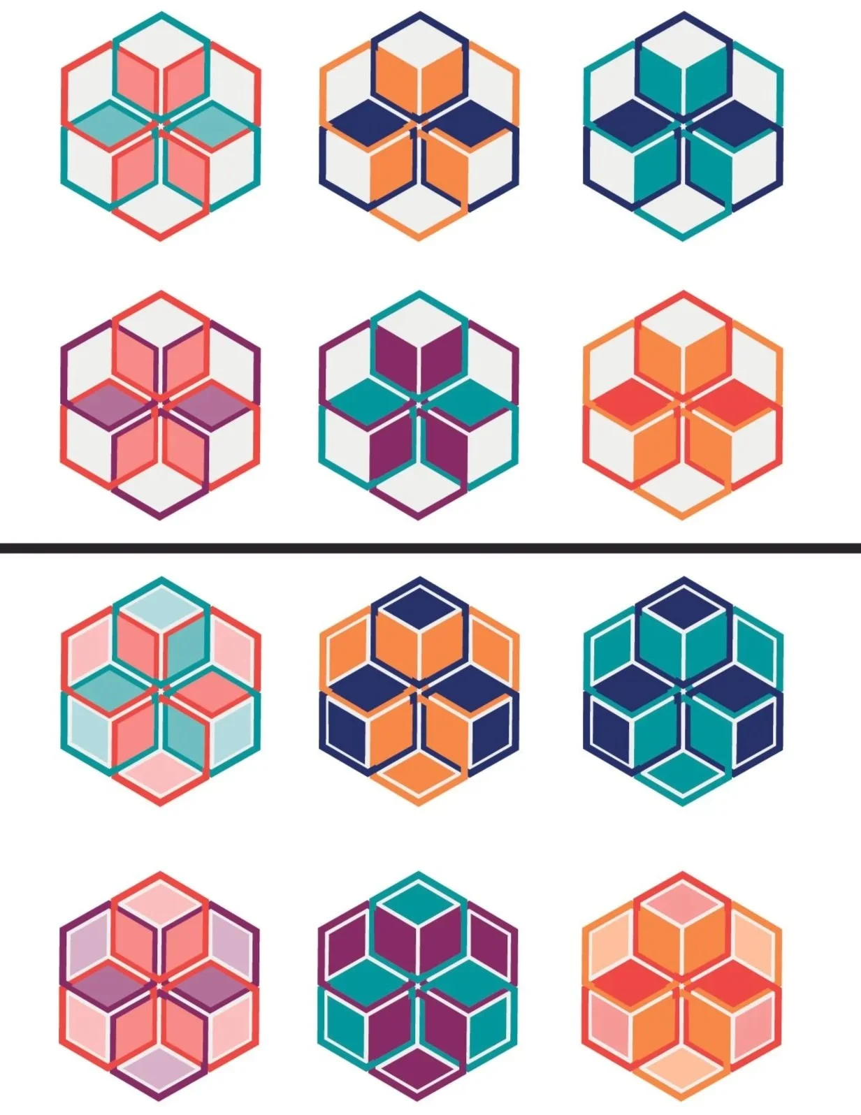
Color Studies and Progressions
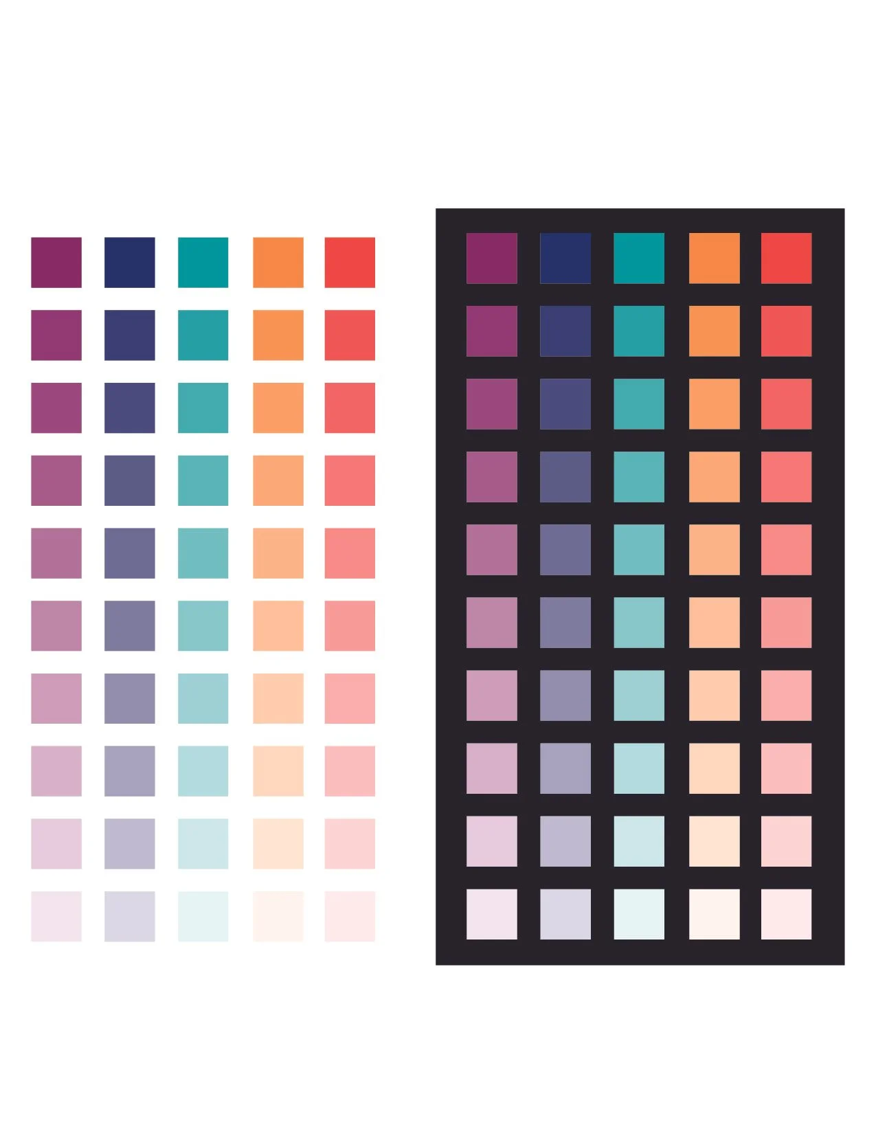
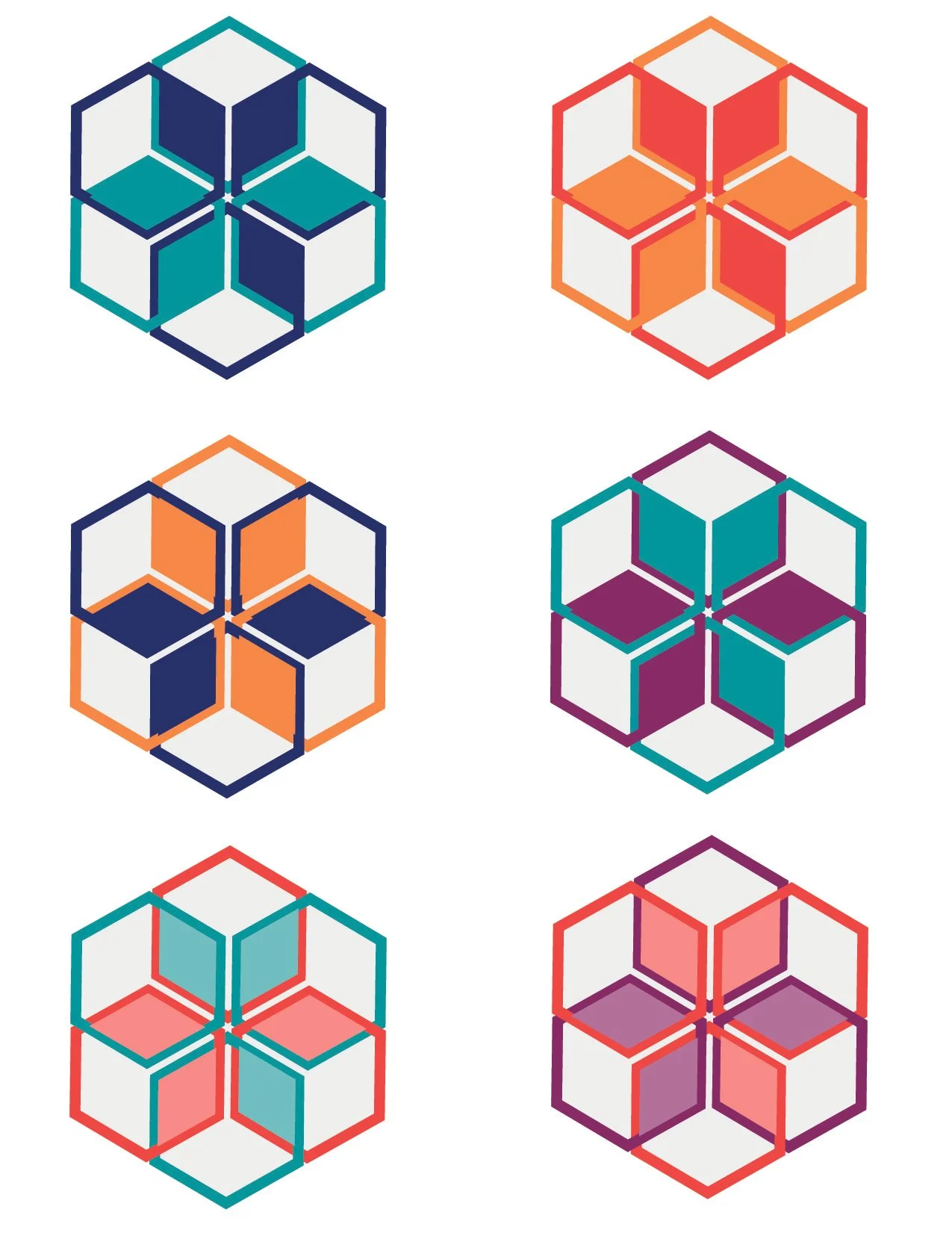
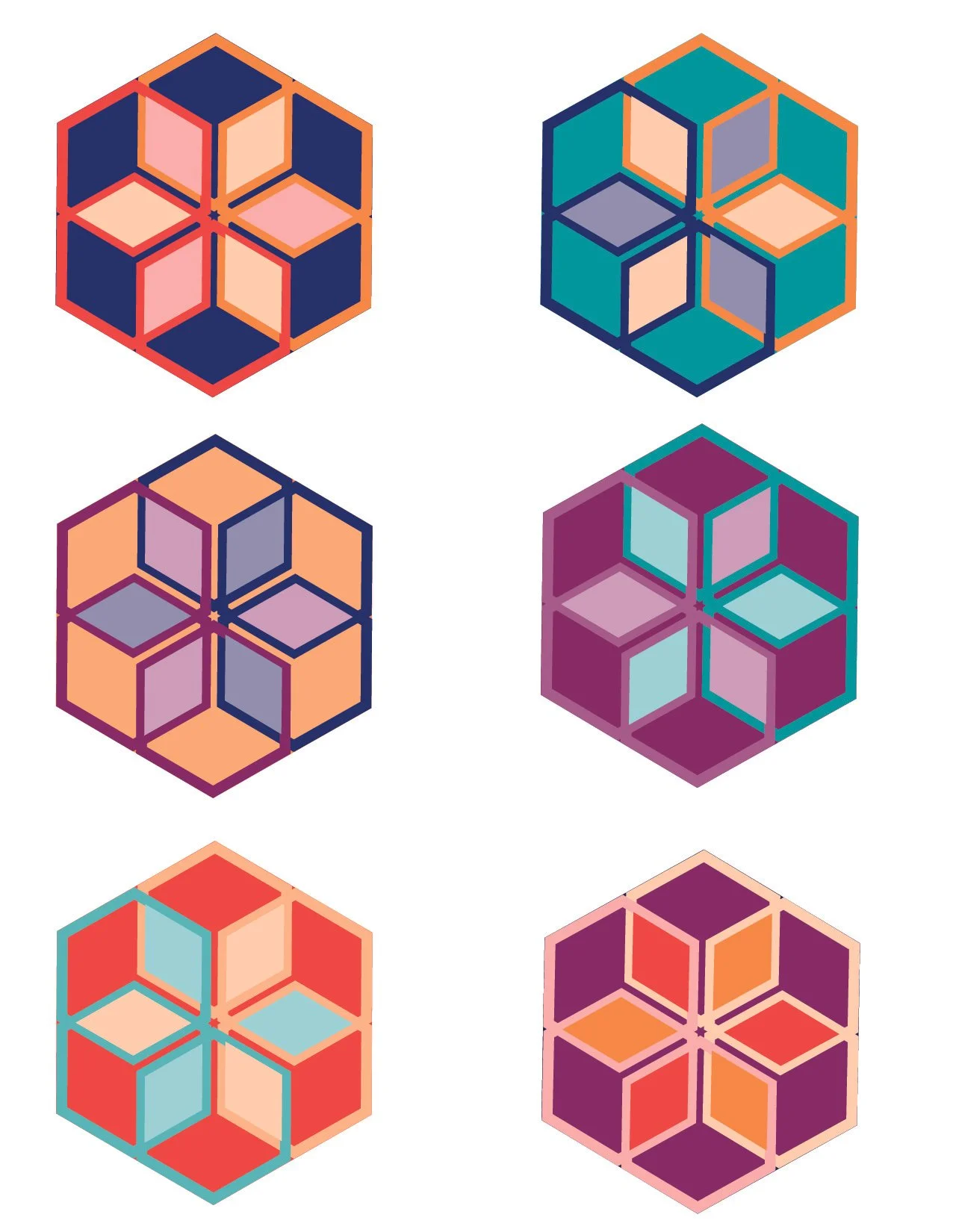
I had way too much fun with this part in the process! I chose some of my favorite colors that worked well together and just had some fun with it. In retrospect, I should’ve tried to be more creative and mess around more with the three colors idea (top right), but in the end, I’m happy with how many different combinations I was able to make. The hardest part was choosing with combination I liked the best.
